Wealthsimple ProdCon 2021
UX Design / User Research / Hackathon Project / First Place 🥇 / Winter 2021
What is ProdCon? ✿
ProdCon is an annual hackathon hosted by the UW PM club that focuses on Product Management. Last year's event was a 1-day hackathon in partnership with Wealthsimple that my friends and I decided to participate in! Although we were a group of designers, tackling a problem from a PM perspective was a fun challenge. Best of all, we also ended up winning first place out of over twenty teams 🥳
Problem Space ✿
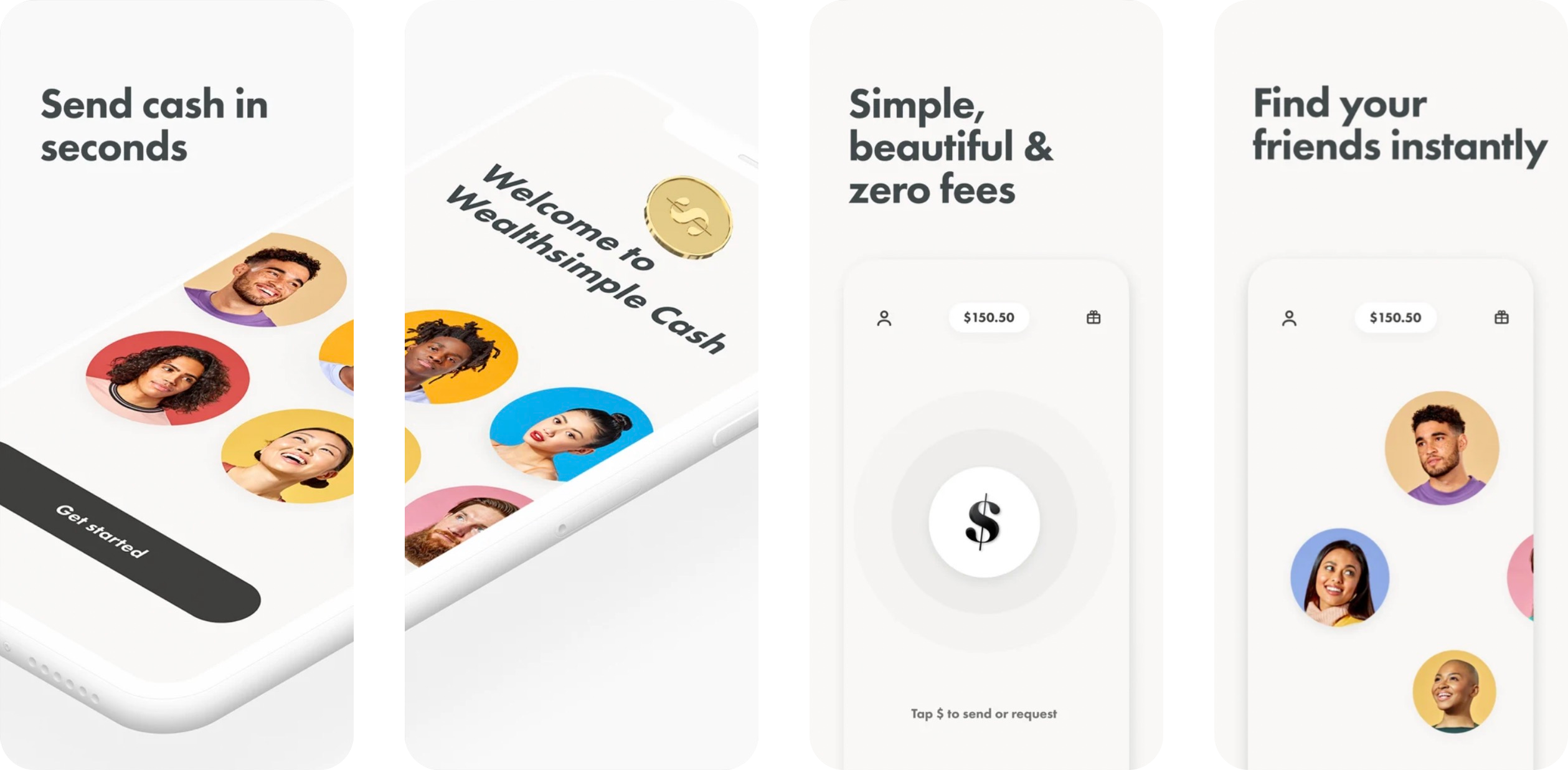
Images from Wealthsimple
Wealthsimple is an innovative financial company that offers various tech products to help users easily manage their finances such as stocks or cryptocurrency. In January 2020, they launched their Wealthsimple Cash app which allows users to send and receive money through their mobile app. They also began various promotions in Canadian Universities to gain exposure in the student community such as offering food deals or club discounts.
Hearing From Current Users ✿
After talking with a few students about their experiences so far, we found that many have downloaded the app to access the promotions that are currently being offered at local businesses. However, this is often the extent to which users interact with the application and continue using e-transfer afterwards.
Competitor Research ✿
To find growth opportunities to focus on in the hackathon, we decided to quickly analyze our current competitors. This helped us discover what Wealthsimple Cash was doing well and what needed help.
Venmo

- Unique features like splitting tabs, earning rewards, social feed, etc.
- 0 fees for transactions
- Preferred method in the USA 🇺🇸
- Only available in the USA
Interac e-transfer
- Only allows for sending and receiving money between one person 👎
- $0.50 - $1.50 fees for transactions 👎
- Lengthier process (adding contacts, security questions, etc.) 👎
- Preferred method in Canada 🇨🇦
- Only available in Canada
Wealthsimple Cash

- Only allows for sending and receiving money between one person 👎
- 0 fees for transactions
- Available between any Wealthsimple account
Our key takeaway was that although Wealthsimple Cash wasn’t lacking features compared to its main competitor (Interac e-transfer), Canadian young adults were already too comfortable with their current methods and don’t feel motivated enough to switch to something new. We also noted that a key feature Cash was lacking was the ability to split bills between friends. From our student perspective and experience using e-transfer, this was a major growth opportunity that we saw the potential to thrive in and led us to our project goal:
Project Goal
How can we design a bill-splitting feature that helps incentive users to switch over to Wealthsimple Cash?
Our Plan of Action ✿
For our plan of action, we decided on these two focuses that we wanted to design.
🏆 Primary Focus
The first focus area is to leverage push notifications to prompt users at moments when they would usually go for traditional payment methods.
As mentioned in our competitive analysis, current users don’t feel incentivized to switch from payment methods they are familiar with. We want to identify those moments and provide users with incentives to encourage the first purchase with Wealthsimple Cash at the stores. The goal is to embed this new payment method into the user’s existing routine and build habits to increase engagement long term.
🥈 Secondary Focus
Our secondary focus is to design the bill-splitting feature to be faster and easier to use than e-transfer. This will encourage users to continue using Wealthsimple long-term as it’s more efficient and user-friendly.
Example User Journey ✿
1. Provide location-based discount push
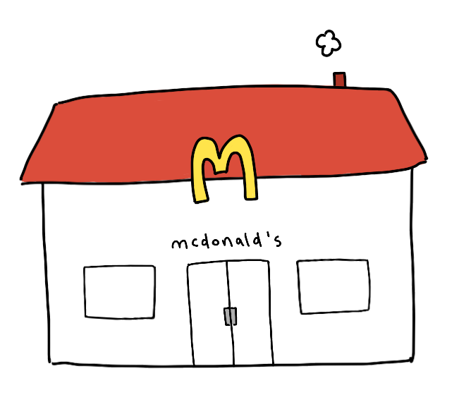
First, we would try to identify moments where a user could utilize Wealthsimple Cash and prompt a location-based discount. For example, they could get a 10% off discount notification when they enter a McDonald’s.

2. Promote the bill-splitting feature when a group of friends are together
If location services recognize that users are visiting with a group of friends, Wealthsimple Cash could also prompt them with the bill-splitting feature in addition to the discount. This will help encourage users to break their old money-transferring habits and reassociate bill-splitting with Wealthsimple Cash.
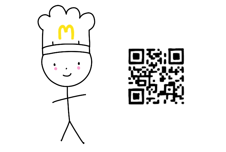
3. Blue-sky opportunity: Paying directly to the restaurant
For future implementation, we can also partner with restaurants to leverage QR codes that customers can directly pay through. This will help customers save time and jump straight into the bill-splitting process on Cash. QR payments have shown to be incredibly successful as well where they have become the primary method of transactions for some countries in Asia.
Mockup Time ✿
FYI: Flows were fleshed out more post-hackathon
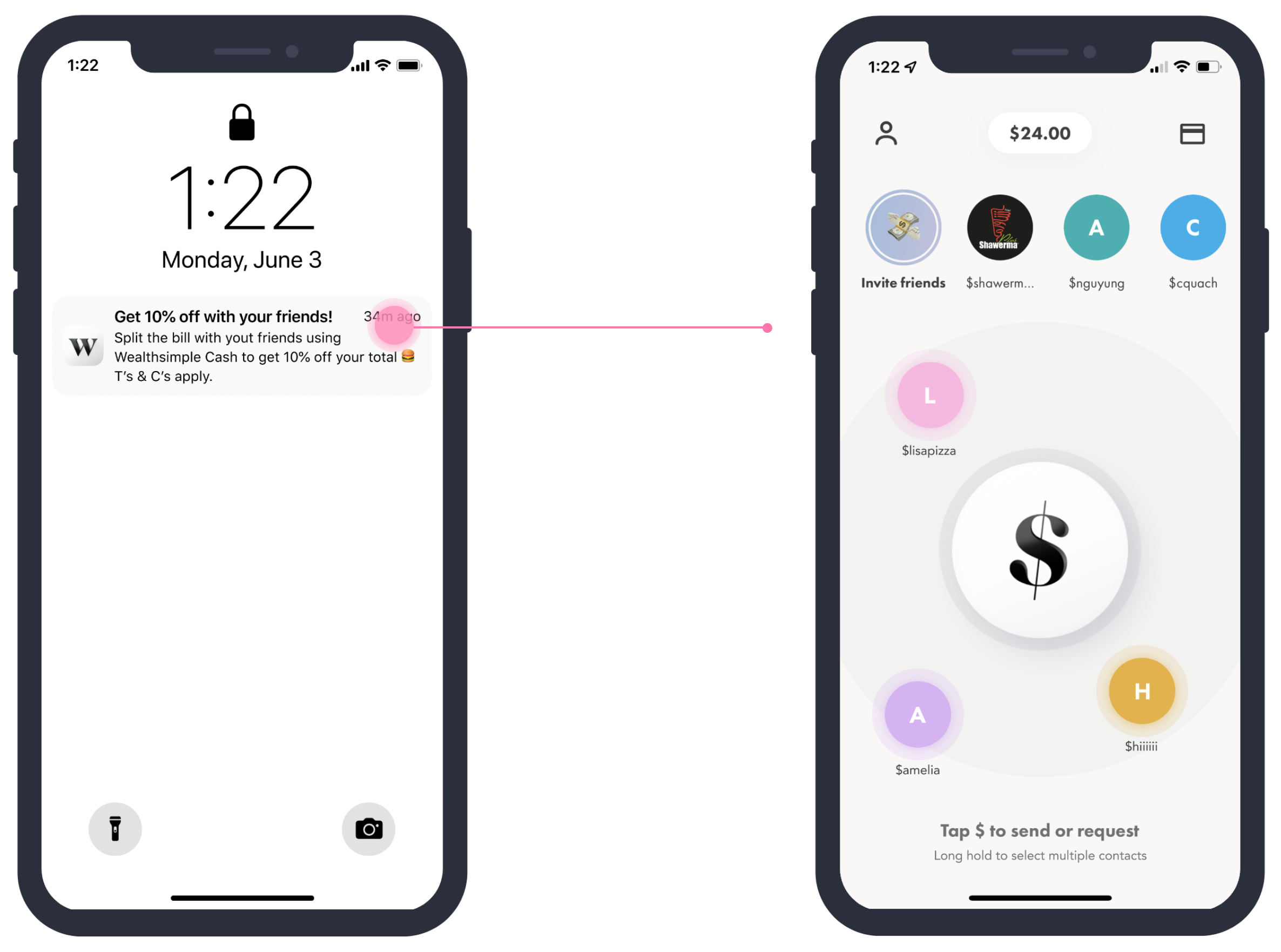
Push notifications to grab the user's attention
Our solution starts with using location services to time the perfect push notifications while you are out with friends. Imagine you and a group of friends are getting together for dinner, Wealthsimple would recognize that multiple users with mutual contacts are together and send a 10% coupon to encourage them to pay using our app. Learning from previous Wealthsimple promotions in Waterloo, students and young professionals love getting a good deal.
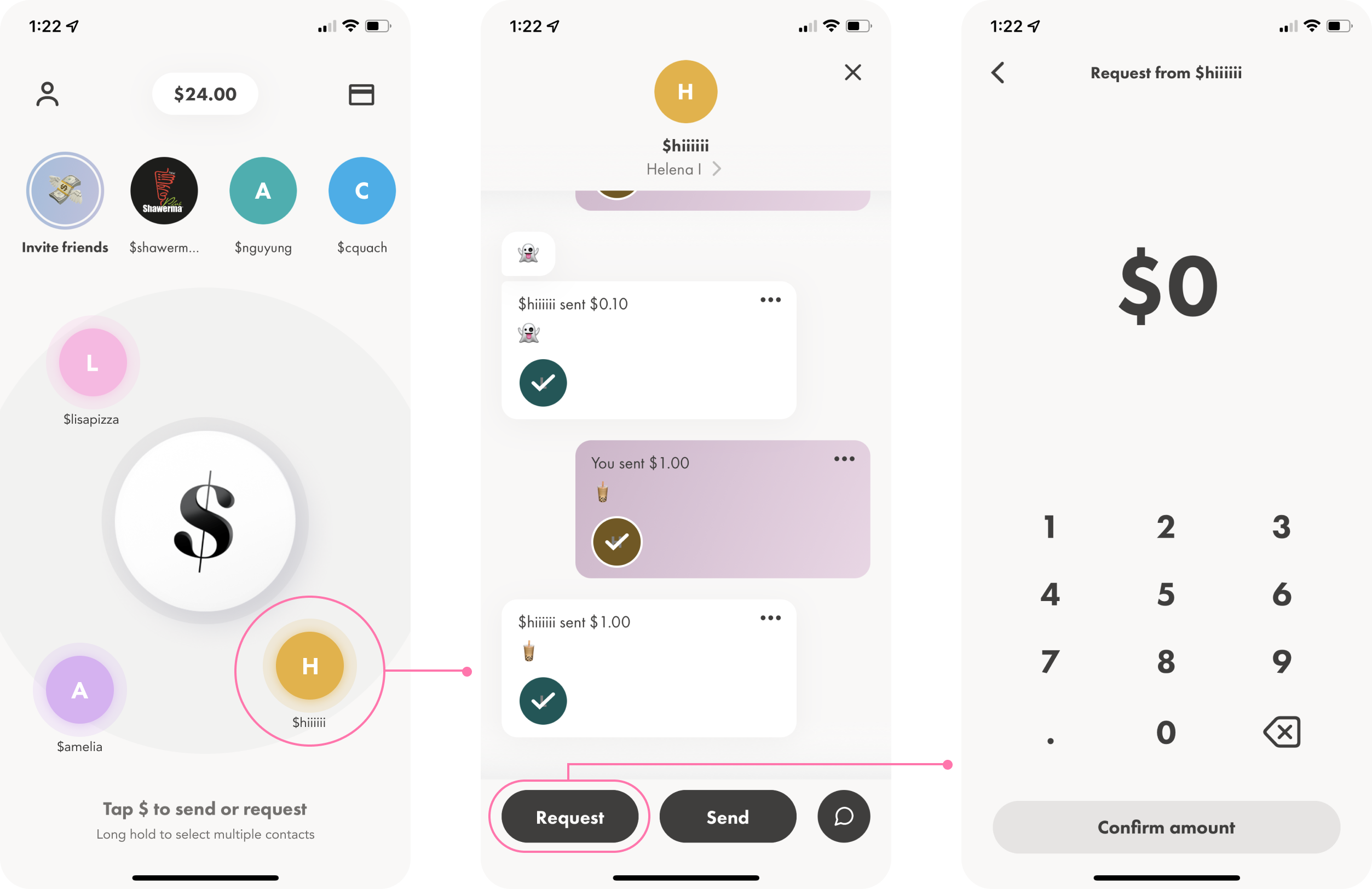
Flow #1: For sending to one contact nearby
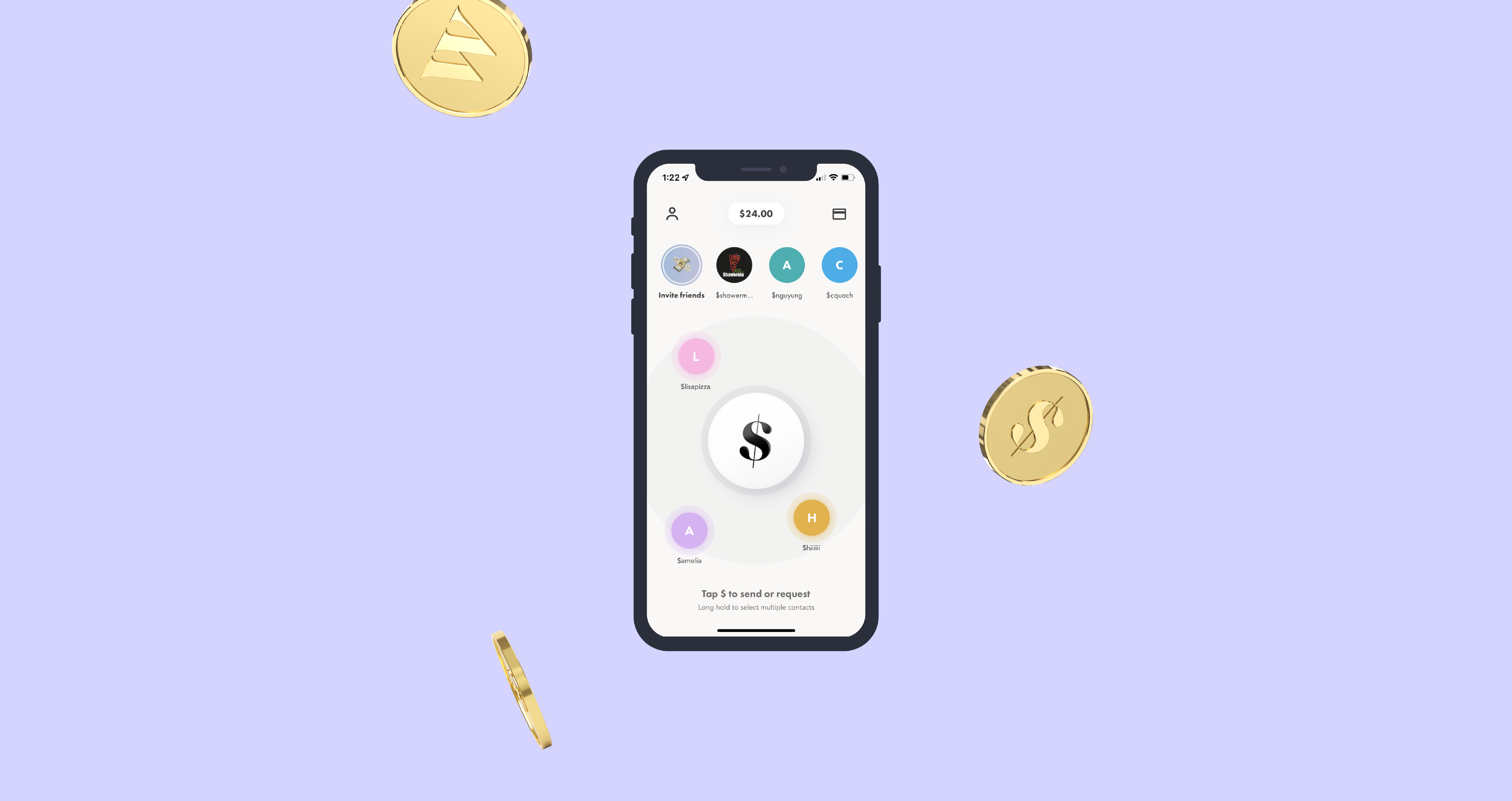
Once they are in the app, the first flow we thought of was for requesting/sending to a singular contact nearby. If other contacts are nearby, a bubble with their handle will appear on the home screen (privacy settings can be adjusted to suit the user’s comfort levels). When a user clicks on someone, they are able to request or send money to that user. Previous transfers are also shown for quick reference if available. The rest of the flow then follows the existing pattern for familiarity.
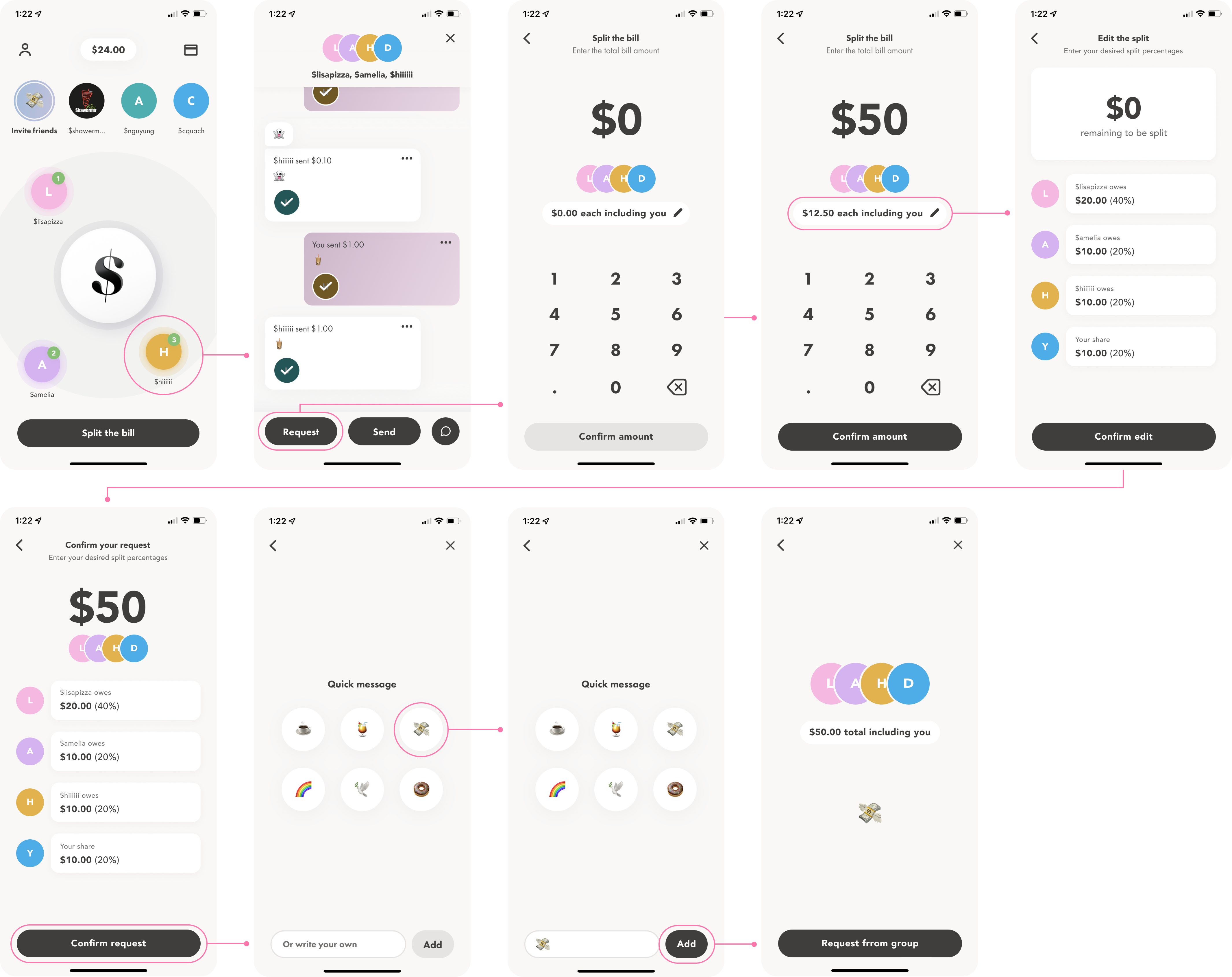
Flow #2: For sending to multiple contacts nearby
The second use case was for requesting/sending to multiple contacts nearby. It follows a similar flow but begins with long holding the first group member to begin multi-selecting. Users can also adjust how they want to divide the bill to suit different situations better.
Learnings and Reflection ✿
Being able to join ProdCon was such a great learning experience and push to try something new. We were quite intimidated to join a technical PM competition as a group of designers but I think our focus to solve for our users gave us an advantage!
We also recently used the Wealthsimple Cash app again and noticed a bill-splitting feature was added 🤔 (*gasp* could it have been inspired by us??)
Potential next steps if there was more time:
Continue fleshing out the flows to include all edge cases and uses
Iterate on different design ideas (due to time constraints, we didn't get to explore too much)
Conduct some user tests to ensure our solution was easy to use